Ticket shop
Easily embedded into your website
Easily embedded into your website
Data-driven decision-making
Easy to use and mobile-friendly
Full service queue management
We can help make your ticket sales a breeze
Seamlessly connect your favourite tools
Avoid administrative headaches
Easy and safe for your ticket buyers
Flexible ticket types for each audience
Upsell and increase your revenue easily
Offer tickets for specific dates and time slots
Handle hybrid events with flexible ticketing
Easily manage multiple ticket shops
Manage your seating plans and entrance
Control queues and busy doors efficiently
Manage events with custom seating plans
Promote multiple events in one ticket shop
How changing our ticket design is a step towards the future
Andy 16 November, 2021 - 3 min. read
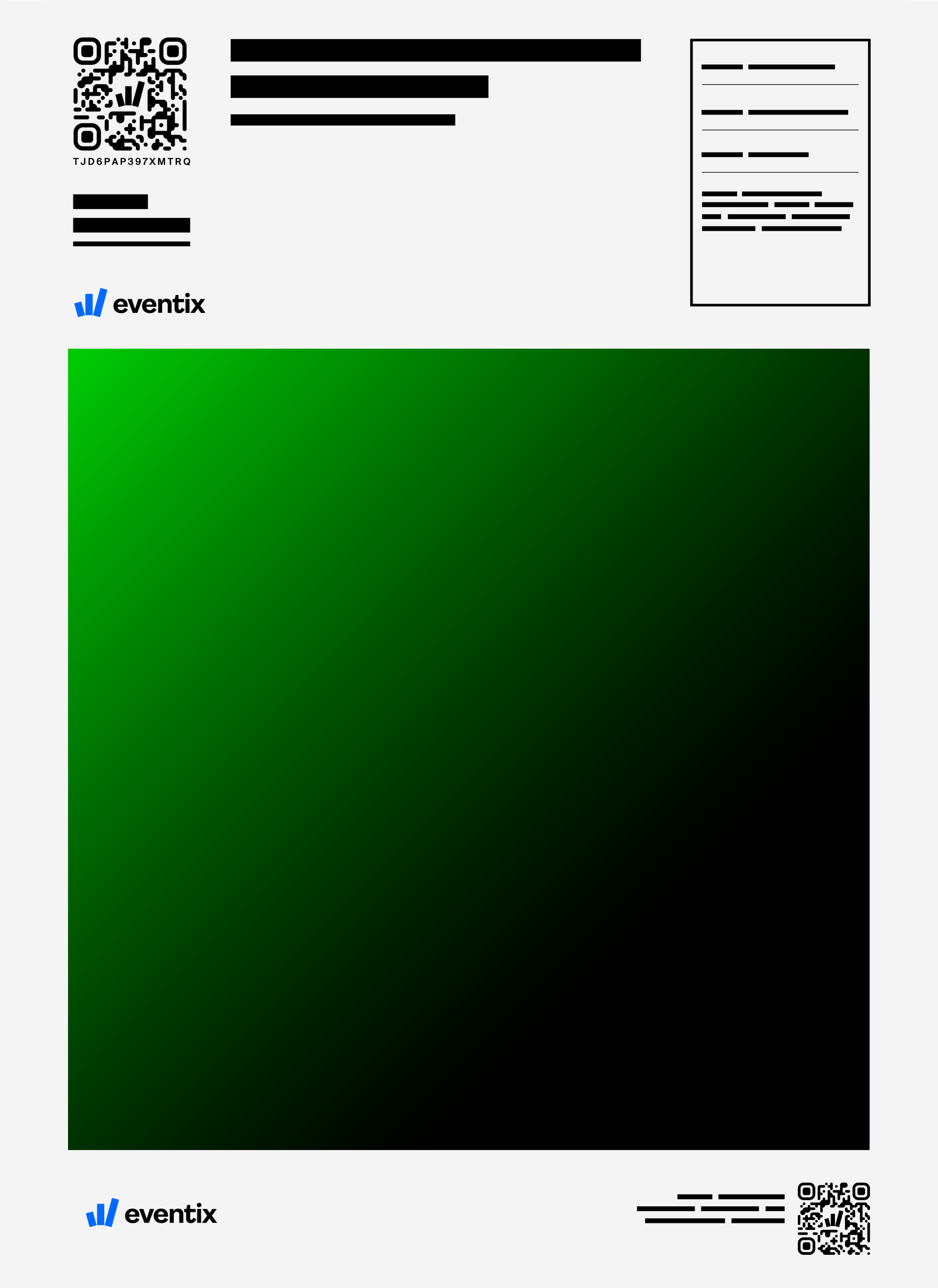
We recently updated the overall design of our tickets to a more straightforward and more easily customisable template. These changes will affect the overall design of the ticket by simplifying the dimensions, leaving space for a square design. In this blog, you’ll read why we decided to make these changes and how you can upload your own ticket image.
In the past, we allowed you to design your tickets by creating a custom design in line with our ticket template. However, we wanted to make the process of personalising your tickets easier. We were able to achieve this by simplifying the dimensions of the ticket design to a square.

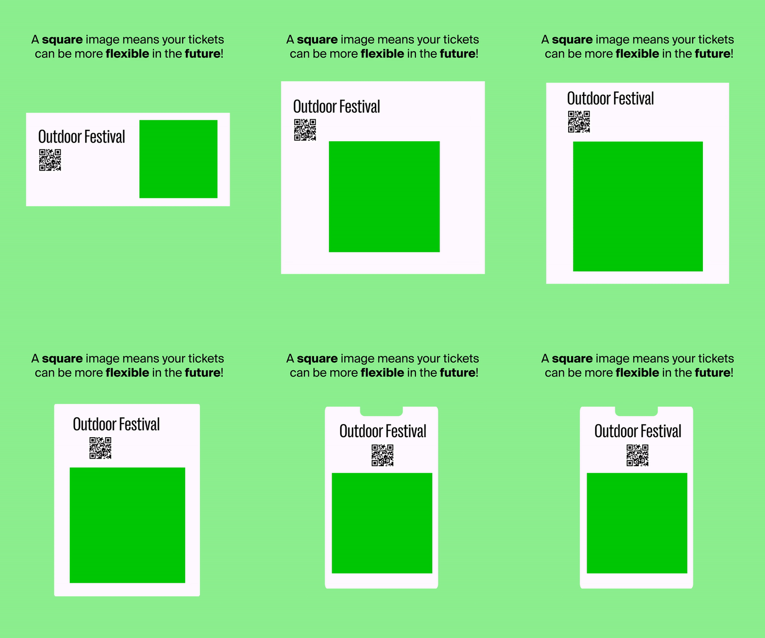
The new design not only makes it easier for you to style your tickets, it also enables us to be more adaptive in how we represent our tickets. Our previous ticket design was specifically catered for an A4-sized piece of paper, and due to the odd shape, this couldn’t be adjusted to fit another format. Due to the simplicity of the square design space on the new tickets, we can easily reshape the tickets to suit particular platforms.
We’ve always believed that ticketing is a mobile-first industry and want to put weight behind that conviction. The vast majority of our A4-sized tickets will never actually be printed on a sheet of paper. Therefore, we want to change the way in which our visitors receive their tickets. Instead of sending our visitors an A4, our idea is to transition to tickets that prioritise the elements that a visitor needs to enter an event. That’s something to look out for in the coming months!
The important part for now is that the new ticket template, and more specifically the square design space, allows for more versatility in the way the tickets are presented. The square design allows us to dynamically adjust the ticket depending on the platform, while retaining your branding. Take a look at the GIF below to get an idea of how the square opens up new options for how the tickets are presented.

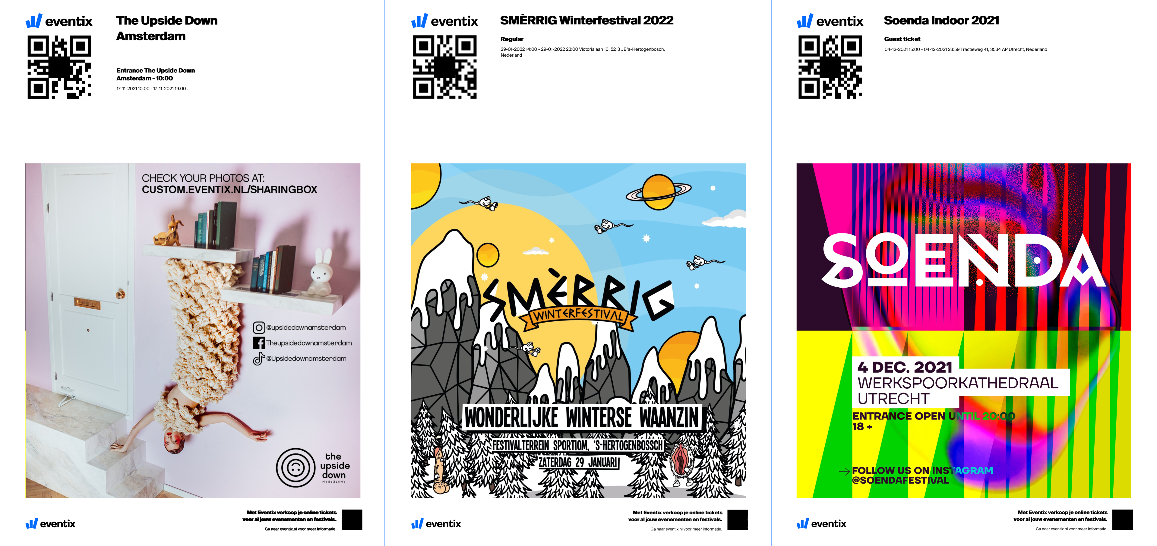
And it’s already working! Plenty of organisers have already uploaded their new square designs. Here are a couple of our favourites so far:

You can now conveniently upload your own ticket image as a .jpg, .png or .pdf file and use any dimensions that you’d like. Ideally, your ticket image should be a square with dimensions of 1080 x 1080 pixels. Regardless of the size, the image will be scaled to fit the ticket. Keep in mind that the actual image file can be no larger than 1.5 MB.
If you would like to switch to the new ticket design, you can do so in a few easy steps. Make sure that you have a new ticket image ready and that it meets the requirements. There are three ways you can upload your ticket image; per ticket type, per event and company-wide. To find out more about how to upload your new ticket image, check out our guide.
Discover all the great possibilities Eventix has to offer and begin building your crowd.
Build ticket shop